Radio
The radio widget provides a group of radio buttons for selecting a single option from predefined choices in your Atlan app. It ensures only one option can be selected at a time, supports help messages, validation feedback, and responsive grid layout. Use the radio widget when you have a small set of mutually exclusive options that users need to choose between.
How it works
The radio widget:
- Displays a group of radio buttons with selectable options
- Ensures only one option can be selected at a time
- Supports help messages and validation feedback
- Integrates with form validation rules
- Supports responsive grid layout
Props
The radio widget uses common widget properties for configuration along with additional properties for radio button behavior. For more information, see Widget properties.
typestringOptional
typestringControls the radio button display mode. When set to 'group', renders a RadioGroup component; otherwise, displays individual radio buttons.
How to use
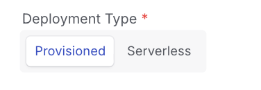
The radio widget is configured with enum values and enumNames to define the selectable options. In the example below, the widget provides a choice between "Provisioned" and "Serverless" deployment types:
{
  "deployment_type": {
    "type": "string",
    "enum": [
      "provisioned",
      "serverless"
    ],
    "default": "provisioned",
    "required": true,
    "enumNames": [
      "Provisioned",
      "Serverless"
    ],
    "ui": {
      "widget": "radio",
      "hidden": false,
      "label": "Deployment Type",
      "help": "Redshift cluster Deployment Type",
      "placeholder": "Deployment Type",
      "rules": [
        {
          "required": true,
          "message": "Please enter a valid deployment type"
        }
      ]
    }
  }
}
See also
- Input—Use for free-form text input
- Credential—Use for secure credential storage
- Widget properties—Complete reference for properties shared across all widgets
Need help
If you face any issues or need help with radio widget configuration, contact Atlan support by submitting a support request.